Recognized globally for their color expertise, the Pantone Color Institute has been putting out a Color of the Year since 2000. The Pantone Color of the Year isn't just a random selection or a forecast of what color might be trendy in fashion or design that year. It is a careful choice made after much thought and consideration, taking into account various factors like global mood, societal attitudes, technological advancements, political climate, and even environmental conditions. Below we will take a journey through all of Pantone's yearly winners, starting where it all began, in 2000!
2000 - Cerulean Blue

Cerulean Blue is characterized by its medium to light intensity and a slight hint of green undertones. The versatile hue is often associated with tranquility, serenity, and a sense of calmness. It is reminiscent of clear skies and peaceful waters, evoking feelings of relaxation and harmony.
2001 - Fuschia Rose

Quite the deviation from the previous year's Cerulean Blue, Fuschia Rose is passionate, intense and exciting, yet also warm and endearing. Fuschia Rose is a vibrant, intense shade of pink that lies on the boundary between pink and purple.
2002 - True Red
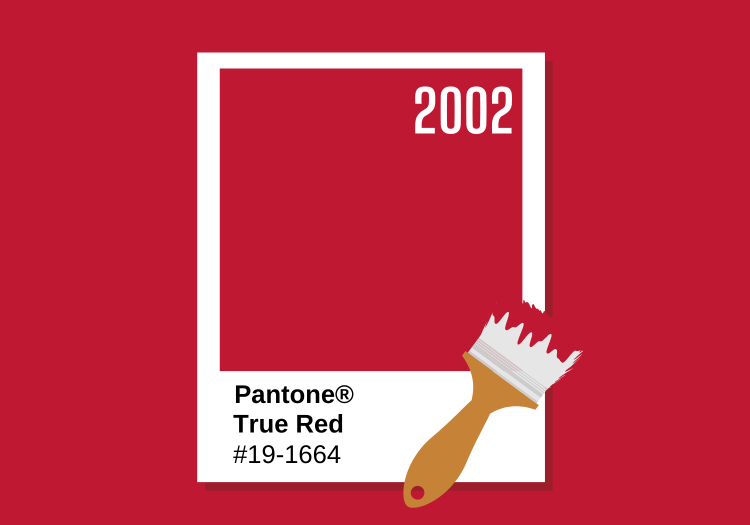
True Red is a highly saturated red with a slightly warm undertone. It is known for commanding attention and making a strong visual impact. This shade of Red is often associated with confidence, assertiveness, and excitement.
2003 - Aqua Sky

Back to blues, 2003 was the debut of Aqua Sky. Aqua Sky is a color that combines blue and green tones to create a fresh and vibrant hue reminiscent of tropical waters. It is often associated with tranquility, serenity, and a sense of calmness.
2004 - Tigerlily
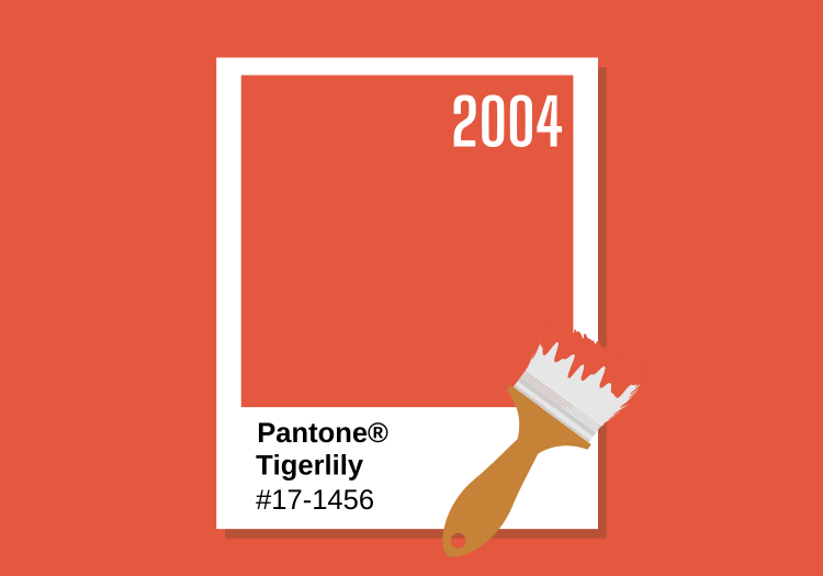
Tigerlily is a vibrant and energetic color inspired by the vivid orange hue found in the petals of a tiger lily flower. It is a warm and intense shade of orange with undertones of red. This bold and eye-catching color exudes enthusiasm, creativity, and confidence. It is often associated with warmth, vibrancy, and a sense of adventure.
2005 - Blue Turquoise

Once again, we find ourselves with a blue hue as color of the year. Blue Turquoise is a refreshing and vibrant shade of blue with green undertones. It draws inspiration from the beautiful turquoise gemstone and the tropical waters of exotic destinations. This shade of blue is both calming and invigorating, offering a balance between serenity and vibrancy.
2006 - Sand Dollar

2006 was the first color that was truly different than the years before. Introducing Sand Dollar, a soft and neutral shade that draws inspiration from the delicate color of sand dollars found on sandy beaches. It belongs to the family of beige and off-white tones. This color is often chosen for its versatility and ability to provide a neutral base that complements many other colors.
2007 - Chili Pepper

Certainly much different than the previous year's color Chili Pepper is a vibrant and fiery red color that draws its inspiration from the spicy and intense red hue of well...chili peppers. It is a rich and energetic shade of red with deep undertones. Chili Pepper is a powerful, attention-grabbing color that exudes passion, excitement, and intensity.
2008 - Blue Iris

Blue Iris is a captivating shade of blue that takes inspiration from the vibrant and enchanting color of the iris flower. It belongs to the family of deep purplish-blue tones. Blue Iris is a rich and sophisticated color that combines the intensity of deep blue with the allure of purple undertones. This shade of blue is often chosen for its unique and distinctive character.
2009 - Mimosa

Mimosa is a bright and cheerful shade of yellow that takes its inspiration from the vibrant and sunny color of the mimosa flower. Mimosa is a warm and inviting yellow that exudes energy, optimism, and joy. This color is lively and uplifting and was chosen because it captures the essence of sunshine and happiness.
2010 - Turquoise

Similar, but still unique from 2005's Blue Turquoise, Turquoise is a vibrant and refreshing shade of blue-green that takes inspiration from the beautiful gemstone turquoise. It is a color that balances the calmness of blue with the invigorating qualities of green. It is a color that conveys a sense of tranquility, escape, and natural beauty.
2011 - Honeysuckle

For our second Pink color of the year, meet Honeysuckle. Honeysuckle is a rich and intense pink color with warm undertones. This is a color that exudes a sense of vitality, playfulness, and confidence. It captures attention and radiates a joyful and spirited energy.
2012 - Tangerine Tango

Tangerine Tango is a bold and dynamic color that combines the vibrancy of orange with a touch of red. It is a color that evokes excitement, enthusiasm, and a sense of adventure. Pantone Tangerine Tango represents a fiery and eye-catching shade of orange.
2013 - Emerald

The first true green to win color of the year, Emerald is a rich and luxurious shade of green that takes inspiration from its namesake, the precious gemstone. It is a deep and vivid green color with a cool undertone, reminiscent of lush foliage and natural beauty. Emerald is known for its association with elegance, sophistication, and prosperity.
2014 - Radiant Orchid

Radiant Orchid is a harmonious blend of purple, pink, and fuchsia tones, creating a vibrant color full of depth. This color exudes creativity, originality, and innovation. It is a bold and expressive shade of purple that symbolizes imagination and artistic flair.
2015 - Marsala

Pantone Marsala is a versatile and elegant color choice that brings a sense of warmth and sophistication to designs. Its deep red-brown tones make it an excellent option for creating visually captivating and timeless compositions that evoke a sense of grounded beauty and richness.
2016 - Rose Quartz & Serenity

A first for Pantone, 2016 was awarded two colors of the year, Rose Quartz and Serenity. The combination of Rose Quartz and Serenity represents a harmonious blend of soft pink and tranquil blue, creating a sense of balance, calmness, and soothing energy. Rose Quartz is a gentle and delicate shade of pink. Serenity, on the other hand, is a serene and airy shade of blue.
2017 - Greenery
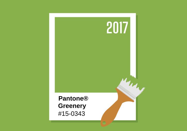
Pantone Greenery is a spirited and energizing color choice that injects designs with a burst of life and an appreciation for nature. Its vibrant green hue makes it an excellent option for creating visually stimulating and invigorating compositions that embody a sense of renewal and embrace the beauty of the natural environment.
2018 - Ultra Violet

Pantone Ultra Violet is a captivating and visionary color choice that brings a sense of intrigue and inspiration to designs. Its deep purple tones make it an excellent option for creating visually striking and thought-provoking compositions that celebrate individuality and embrace the limitless possibilities of the future.
2019 - Living Coral

A deviation from the greens and purples of the past couple years, Living Coral comes in to inject some much-needed vibrancy. Living Coral is a joyful and spirited color that combines the vivaciousness of orange with the vibrancy of pink. It is a hue that evokes optimism, playfulness, and a zest for life.
2020 - Classic Blue

Classic Blue is a is a timeless and enduring shade of blue, reminiscent of your favorite dark-wash jeans. Its deep blue tones make it an excellent option for creating visually harmonious and trustworthy compositions that celebrate a sense of stability and inspire a calm and reflective atmosphere.
2021 - Illuminating & Ultimate Gray

Another year blessed with two colors of the year was 2021. Illuminating and Ultimate Gray are a compelling color combination that represents the union of optimism and strength. Illuminating is a bright and vibrant shade of yellow, while Ultimate Gray, on the other hand, is a solid and dependable shade of gray. Their contrasting yet complementary nature creates a visual harmony that encourages resilience and positivity in the face of challenges, reminding us of the power of hope and stability.
2022 - Very Peri

Very Peri combines shades of blue and deep violet with red undertones. It has a depth and saturation that adds a sense of mystery and allure. This shade of periwinkle can evoke a feeling of tranquility and sophistication.
2023 - Viva Magenta

This year's color of the year is, Viva Magenta. Viva Magenta is a rich, intense shade that falls within the family of purplish-red hues. It is a vibrant and captivating color that exudes strength and sophistication. Viva Magenta exudes a rebellious spirit and zest for life.
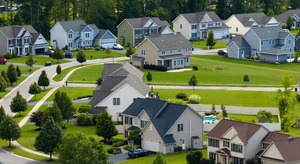
Whichever year catches your eye, Pantone's color of the year can be a unique tool in determining what paint colors you might want in your home. From accent walls to decorative elements, these globally recognized shades can provide a fresh palette and inspiration to transform your home into a personal sanctuary reflective of the world's pulse and your individual style.